Comparisons
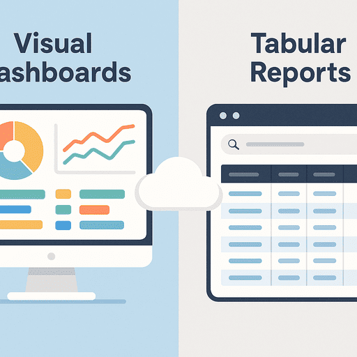
Visual Dashboards vs Tabular Reports: When to Use Each
When dashboards outperform tables—and when detailed reports work better for audits, accuracy, and operational decisions.
Understand the key differences between visual dashboards and tabular reports in asset and inventory management — and when each delivers the most value.
Introduction
Every business relies on data visibility to make better decisions, but how you present that data can determine whether people actually understand and act on it.
In asset tracking and inventory management, teams often debate between visual dashboards and tabular reports — both powerful, but designed for different purposes.
This article breaks down when to use each, how to combine them effectively, and what metrics fit best in each format.
1. The Purpose of Each Format
| Format | Ideal For | Description |
|---|---|---|
| Visual Dashboards | Real-time insights & monitoring | Data summarized in charts, gauges, or cards for quick pattern recognition. |
| Tabular Reports | Detailed auditing & compliance | Raw or structured data lists used for verification, export, and filtering. |
In short:
- Dashboards answer “what’s happening?”
- Reports answer “what exactly happened?”
Both are essential, but the audience and intent dictate which should take priority.
2. When to Use Visual Dashboards
Dashboards excel when speed and comprehension matter most.
They provide high-level context and highlight trends that would otherwise get buried in data tables.
Best scenarios:
- Monitoring asset utilization rates
- Tracking active vs. inactive devices
- Visualizing maintenance cycles
- Spotting anomalies or discrepancies quickly
Dashboards work best for executives and managers who need performance snapshots without sifting through details.
If you’re building an asset KPI view, this list of metrics helps you choose what belongs on the dashboard vs in drill-down reports: KPI Dashboard for Asset Managers: Metrics That Matter.
Advantages:
- Real-time updates and alerts
- Intuitive color-coded visuals (green = OK, red = alert)
- Easy to present in meetings
- Helps prioritize action immediately
Limitations:
- Can oversimplify data
- Not suitable for audits or data exports
3. When to Use Tabular Reports
Tables remain the backbone of data transparency and compliance.
Best scenarios:
- Running asset audits
- Verifying depreciation or condition changes
- Preparing tax or compliance documents
- Reconciling transactions or inventory movements
For a concrete “what to verify” list during audits (and what evidence to keep in tables/exports), use: Inventory Audit Checklist: What to Verify and How Often.
Advantages:
- Provides exact figures
- Easier to filter, export, and share
- Enables precise cross-referencing with databases
- Essential for compliance and financial tracking
Limitations:
- Requires more time to interpret
- Not suitable for quick decision-making
4. Combining Both for Maximum Impact
The most mature organizations blend both formats seamlessly:
- Dashboards for summaries — show KPIs, trends, and exceptions.
- Reports for evidence — provide the raw details behind those visuals.
For instance:
- A dashboard card shows “12 overdue assets.”
- The related report lists which assets, who has them, and where.
This layered approach ensures executive visibility and operational accountability simultaneously.
To make overdue and discrepancy signals actionable, pair dashboards with automated reminders and escalations: Inventory Notifications and Escalation Workflows.
5. Choosing the Right Metrics for Each
| Metric Type | Dashboard | Report |
|---|---|---|
| Asset availability (%) | ✅ | |
| Maintenance frequency | ✅ | |
| Depreciation history | ✅ | |
| Audit discrepancies | ✅ | ✅ |
| Assigned assets by user | ✅ | ✅ |
| Procurement cost | ✅ |
The trick is to summarize trends visually and store context in reports for deeper analysis.
6. UX and Accessibility Considerations
- Dashboards should be mobile-friendly with clean visual hierarchy.
- Tables should support export formats (CSV, XLSX, PDF).
- Use consistent color schemes and labeling across both.
- Make visuals interactive — clicking a chart opens its corresponding report.
When designed together, dashboards and reports reinforce one another instead of competing.
7. Common Mistakes to Avoid
- Relying solely on charts without drill-down data
- Overloading dashboards with metrics that change rarely
- Ignoring accessibility — color-only indicators hurt inclusivity
- Keeping reports static without filters or date ranges
Remember: visualization isn’t decoration — it’s data storytelling.
Conclusion
Dashboards and reports aren’t rivals — they’re partners in decision-making.
Dashboards help you see patterns, while reports help you prove them.
Used together, they turn static numbers into actionable insight.
Related reading
- Asset Tracking Software vs ERP Modules: What to Choose?
- Top 10 Inventory Management Tools Compared
- Risk Management in Asset Tracking — From Theft to Data Breaches
- Asset Class Segmentation for Reporting: A Practical Guide
- Automating Audit Alerts: How to Catch Discrepancies Early
Methodology
- This page was reviewed against adjacent InvyMate workflow pages and the external references listed below.
- Recommendations are written for practical asset-tracking operations and are intended to stay specific about workflow scope, tradeoffs, and implementation boundaries.
- This page was reviewed as a comparison or buyer-evaluation page, so the emphasis is on workflow fit, rollout effort, and operational tradeoffs rather than feature-list breadth.
Related Standards and Guidance
- CIS Critical Security Control 1: Inventory and Control of Enterprise Assets · Center for Internet Security
- NIST SP 800-171 Rev. 3 · NIST
Try InvyMate
Start tracking assets with QR codes and scheduled audits.