Best Practices
Asset Check-In/Out Flow Design: UX That Reduces Errors
UX principles for asset check-in/out flows that reduce errors with clear states, confirmations, and timely reminders.
Discover how intuitive UX design in asset check-in/check-out workflows minimizes human error, speeds up operations, and improves accountability.
Introduction
Even the most advanced asset management system can fail if its check-in/check-out flow confuses users.
When employees can’t find assets, forget to return them, or log them incorrectly, operations slow down and accountability erodes.
The solution isn’t just better technology — it’s better UX.
An efficient check-in/out experience can cut error rates, speed up audits, and increase user adoption dramatically.
1. Why UX Matters in Check-In/Out Systems
Asset checkouts often happen in high-pressure environments — a technician needs a laptop, a camera, or a set of tools now.
If you’re seeing frequent loss or “missing” items, pair UX fixes with stronger accountability practices: Why Shared Inventory Fails Without Accountability (and How to Fix It).
If the process takes too long or feels unintuitive, users will bypass it altogether.
Common pain points include:
- Overly complex forms
- Unclear asset statuses (available, reserved, in repair)
- Lack of confirmation or reminders
- Poor mobile usability
Good UX design focuses on removing friction from each of these touchpoints.
2. Core Principles of an Effective Check-In/Out UX
| Principle | Description | Result |
|---|---|---|
| Clarity | Use color-coded statuses and icons for availability. | Faster decisions |
| Speed | Enable QR/NFC scanning instead of manual typing. | Fewer input errors |
| Feedback | Provide instant confirmation and return reminders. | Higher compliance |
| Context | Show who last used the item and where it is now. | Better transparency |
| Accessibility | Design mobile-first forms and large tap targets. | Easier field usage |
| Consistency | Keep flow uniform across desktop and mobile. | Less confusion |
These simple UX decisions often determine whether a system is actively used or ignored.
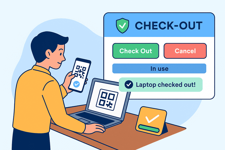
3. Anatomy of a User-Centered Check-In/Out Flow
A well-designed flow typically includes:
- Asset Identification
- Scan a QR/NFC tag
- Auto-load item details and status
- User Verification
- Authenticate via SSO or employee ID
- Auto-fill user info to reduce typing
- Purpose Selection
- Choose reason (maintenance, fieldwork, audit, etc.)
- Checkout Confirmation
- Show a summary: item name, expected return date, and location
- Require confirmation via one tap
- Return Process
- Rescan tag to mark item as returned
- Prompt for condition and photo if needed
This flow ensures traceability without overwhelming the user.
4. Reducing Human Errors Through Smart Design
To minimize common errors:
- Autocomplete and predictive fields reduce typing mistakes.
- Barcode or QR scanning eliminates manual ID entry.
- Return reminders via email or mobile push prevent asset loss.
- Role-based permissions limit who can approve or modify checkouts.
- Conditional logic ensures that damaged or overdue assets trigger alerts automatically.
For the permission model behind safer checkouts, see: Role-Based Permissions in Inventory Systems.
These patterns ensure the system acts as a guide, not a barrier.
5. Visual Hierarchy and Cognitive Load
The most successful UX designs use:
- Clear color hierarchy (green = available, red = checked out).
- One primary action per screen (e.g., “Check Out” button).
- Minimal required fields, delaying optional data entry.
- Step-by-step progress bars for longer flows.
Reducing cognitive load encourages faster, more accurate use — especially on mobile.
6. The Role of Notifications and Reminders
Smart notifications are a hidden UX strength:
- “Your checked-out laptop is due tomorrow.”
- “Toolbox #2 is overdue — please confirm location.”
- “New asset available: projector room 3.”
Reminders keep users engaged while reducing follow-up work for admins.
To make reminders effective (and avoid alert fatigue), implement escalation rules: Inventory Notifications and Escalation Workflows.
7. Integrations That Streamline UX
A check-in/out flow doesn’t live in isolation.
Integrate it with:
- HR systems to link assets to active employees
- Maintenance apps to auto-create repair tickets
- Slack/Teams for reminders and notifications
- Accounting tools to track asset usage costs
This transforms the process from an isolated task into a connected workflow.
8. Measuring Success in UX Terms
Use measurable UX metrics:
- Error rate per transaction
- Average checkout time
- User completion rate
- Frequency of overdue returns
- Mobile vs desktop adoption ratio
Tracking these data points helps fine-tune design and justify improvements.
Conclusion
A check-in/out flow isn’t just a form — it’s the heartbeat of operational accountability.
By prioritizing UX clarity, speed, and feedback, organizations can eliminate friction, reduce loss, and ensure smooth asset circulation.
A good UX design doesn’t just track assets — it builds trust.
Related reading
- 5 Inventory Tracking Mistakes Coworking Spaces Make
- How QR Code Tagging Revolutionizes Inventory Tracking
- Equipment Reservation Rules: Best Practices for Shared Assets
- Physical vs Digital Asset Tracking: Key Differences
- Best Practices for IT Asset Lifecycle Management
Methodology
- This page was reviewed against adjacent InvyMate workflow pages and the external references listed below.
- Recommendations are written for practical asset-tracking operations and are intended to stay specific about workflow scope, tradeoffs, and implementation boundaries.
Related Standards and Guidance
- FEMA Property Management Inventory Guidance · U.S. Government Accountability Office
- CIS Critical Security Control 1: Inventory and Control of Enterprise Assets · Center for Internet Security
Try InvyMate
Start tracking assets with QR codes and scheduled audits.