Best Practices
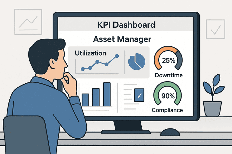
KPI Dashboard for Asset Managers: Metrics That Matter
The KPIs that matter most for asset managers (utilization, downtime, audits, TCO) and how to design dashboards that drive action.
Use dashboard KPIs to answer practical operating questions: what is unverified, what is overdue, what keeps breaking, and what should be replaced next.
TL;DR
The most useful dashboard for a small IT team usually starts with:
- unverified assets
- assigned assets without a current owner check
- overdue returns and open exceptions
- maintenance backlog and repeat failures
- refresh-cycle coverage by quarter
If your audit metrics are inconsistent, fix the workflow first: Inventory Audit Playbook.
Introduction
Most asset dashboards fail because they report a lot but answer very little.
For a small IT team, the goal is not to build an executive wall of charts. The goal is to see which laptops, monitors, docks, and shared devices need action this week.
That means your dashboard should help with operational decisions such as:
- which assets still need verification
- which returns are open
- which equipment keeps consuming maintenance time
- which categories are approaching refresh
This guide focuses on KPI choices and dashboard examples that are useful for lean teams running day-to-day asset operations.
1. Why KPI Selection Matters
Good KPIs reduce ambiguity.
Instead of asking vague questions like "How is asset management going?", the dashboard should answer:
- What is not verified right now?
- Where is ownership unclear?
- Which devices are aging into refresh risk?
- Which workflows generate the most exceptions?
That is what makes the dashboard operational rather than decorative.
2. Four KPI Groups That Matter
| KPI group | What it answers | Typical action |
|---|---|---|
| Verification | What has not been checked recently? | Run an audit or follow up on exceptions |
| Ownership | Who has what, and where is drift appearing? | Fix assignments, returns, and overdue items |
| Reliability | What breaks or stalls work repeatedly? | Prioritize maintenance or replacement |
| Refresh planning | What should be budgeted or replaced next? | Plan purchases and retirements |
3. Essential Dashboard KPIs
1. Unverified assets count
Track how many assets have gone past your verification window.
This is often the fastest leading indicator of register drift.
2. Unknown-owner assets
Count assets that are marked assigned, in use, or unavailable without a clean current owner or location.
For small teams, this KPI matters more than a generic utilization rate.
3. Overdue return exceptions
Measure how many offboarding, loaner, or inter-office handoffs are still unresolved.
Support page: IT Asset Return Policy (Template for Small IT Teams).
4. Maintenance backlog
Show open issues by category, age, or location.
This helps separate one-off repairs from repeat failure patterns.
5. Repeat failure count
Count assets or models that have hit the same issue more than once in a defined period.
That is often more actionable than a broad MTBF metric for small teams.
6. Refresh-cycle coverage
Track how many assets fall inside the next planned refresh window.
This is useful for budgeting and procurement timing.
7. Audit completion rate
Track completed verification sessions against planned sessions by period.
Operational guide: Inventory Audit Playbook.
8. Change-history visibility
A dashboard does not need to show every history event, but it should surface whether the underlying data is traceable.
Useful references:
4. Small-Team Dashboard Example
If you manage laptops and peripherals for a lean IT team, a practical dashboard could use four rows:
- Exceptions row
- overdue returns
- missing assets
- assets with unknown owner
- Verification row
- assets not checked in 90 days
- current audit session progress
- Reliability row
- open maintenance items
- repeat repair models
- Planning row
- refresh due this quarter
- category-level replacement cost view
That is usually more useful than a dashboard built around generic utilization and depreciation alone.
5. Visualization Types That Actually Help
| Visualization | Best use |
|---|---|
| KPI cards | Open exceptions, overdue returns, unverified assets |
| Bar chart | Assets due for refresh by category or location |
| Trend line | Verification completion over time |
| Table | Open issues that need direct follow-up |
| Stacked bar | Lifecycle stage by category |
Dashboards should make it obvious what needs investigation next, not just what happened historically.
6. Data Sources to Trust
For small teams, the dashboard is only useful if the source data is stable.
Prioritize:
- one asset register
- one assignment history source
- one audit workflow
- one place for maintenance status
If you later export to BI tools or spreadsheets, keep the system of record stable underneath.
If you need to connect inventory data elsewhere, use: API access.
7. Common Dashboard Mistakes
- tracking too many KPIs at once
- using broad executive metrics without linking them to action
- mixing stale spreadsheet data with live operational data
- reporting audit completion without tracking exceptions
- hiding the underlying owner or history context behind summary cards only
FAQ
What are the top KPIs for small IT teams?
Start with unverified assets, unknown-owner assets, overdue returns, maintenance backlog, and refresh-cycle coverage.
How do you measure audit completion cleanly?
Define the audit cadence first, then measure completed sessions versus planned sessions. Keep the process repeatable with one playbook and one history trail.
Do we need a BI tool to start?
No. Most small teams should start with a straightforward in-product dashboard. The hard part is not charting. It is keeping ownership, verification, and exception data accurate.
Conclusion
The best dashboard for a small IT team is not the one with the most KPIs. It is the one that shows where asset operations are drifting and what to fix first.
If the dashboard helps your team close returns, verify assets, and plan refreshes earlier, it is doing the job.
Related reading
- Inventory Audit Playbook
- Assignments & History
- Asset Audit History
- IT Asset Return Policy (Template for Small IT Teams)
- Asset Depreciation Methods: Explained with Examples
- Visual Dashboards vs Tabular Reports: When to Use Each
- Asset tracking built for small IT teams
- IT Asset Management Hub
Methodology
- This page was reviewed against adjacent InvyMate workflow pages and the external references listed below.
- Recommendations are written for practical asset-tracking operations and are intended to stay specific about workflow scope, tradeoffs, and implementation boundaries.
Related Standards and Guidance
- CIS Critical Security Control 1: Inventory and Control of Enterprise Assets · Center for Internet Security
- NIST SP 800-171 Rev. 3 · NIST
Try InvyMate
Start tracking assets with QR codes and scheduled audits.